The problem: HelloMD’s community section was not engaging users or generating registrations.
HelloMD’s primary experience was once a newsfeed like community, featuring articles, Q&A and product reviews.
As the volume of content we produced went up, the community became more difficult to navigate. New types of content didn’t fit well and the most popular content was buried quickly.
Engagement with this content also fell steadily while demand for educational content around cannabis went up.
Leadership tasked the design team to reimagine the experience. Instead of a community for cannabis enthusiasts, we should have an education platform for new cannabis consumers.
We were also in the midst of designing v1 of our mobile app and redesigning the medical intake form. Nonetheless, this was given high priority. We had two weeks to get it designed and ticketed.
Understanding our audience

HelloMD/ Brightfield Group Study (click for full study)
HelloMD conducted a massive study with the Brightfield Group to better understand the market for medical and recreational cannabis products in lieu of legalization and the passage of the Farm Bill.
Some relevant takeaways:
- A majority of cannabis consumers are new to cannabis and want to experiment with reputable brands and products they can trust
- New cannabis consumers are mostly female, (about 60/40)
- New cannabis consumers are using cannabis to address a common health issue
- New cannabis consumers are hungry for trustworthy information on brands and products
- Approximately 30 percent of new cannabis consumers are advocates for/ buying on behalf of a family member or a friend
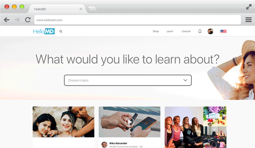
Quick experiment: I changed the “Community” link on the main nav to “Learn” (just a text change to see if people would click it more) and here’s what happened:
Goals for the learn section: Organize content in a way that makes the most sense to a new cannabis consumer, integrate new content types like video and livestream. Also improve search.
First pass:
The idea here was to have a wizard that gathers some information and then serve up content according to the answers. Two problems arose: First, some stakeholders wanted the form gather useful data. While I could see the virtue of that, it was going to make it much longer and less user friendly. Second, certain combinations of answers yielded lots of results and others yielded very few, or none at all. It would be a lot of work for the content team to game out all the possible answer combos and produce content for them.
Option two: A tag cloud like filter that would organize content by topic
The problem with this one was that we had north of 75 tags, which the content team agreed they could trim to 50, but that was still way too many to list at the top of the page.
Option three: Search bar with clever autocomplete
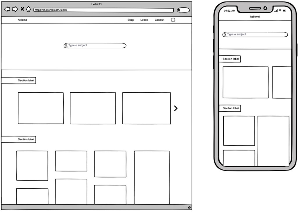
We ended up going with this option, as it was the least problematic of the three. The search bar features the top ten terms in a drop down list when you first click it. From there, each keystroke narrows the list of terms. If there are no terms matching the query, the list falls back to the list of ten.